
When it comes to choosing your wedding colour palette, it seems like an easy decision at first but as you start looking at inspiration on Pinterest, Instagram, Tik Tok, the options seem endless and what seemed like it was going to be an easy choice, suddenly turns in to you changing your mind 100 times.
However, there is a method to choosing your wedding colour palette and this is going to make it 10 x easier for you to make sure your wedding colour palette looks cohesive and doesn’t feel like a never ending decision.
You do not need to match every ribbon, flower and place card perfectly. The aim is to choose colours that feel comfortable together and carry them through your day in a way that feels considered.
Whether you are planning a garden ceremony in Norfolk, a Suffolk country house celebration or a marquee reception in Cambridgeshire, here is how to build a wedding colour scheme that works with your setting, your budget and your personal style.
Start with how you want your wedding to feel
Before you begin comparing shades of green, talk about the atmosphere you want to create.
Would you like the day to feel relaxed and full of garden flowers? Are you drawn to soft, understated details? Or do you love rich colours, warm lighting and a more dramatic evening setting?
Choose three descriptive words together. These might be “fresh, natural and informal” or “warm, elegant and colourful”. They give you something useful to return to when your saved photographs start pulling you in different directions.
Next, look beyond wedding inspiration. Your home, clothes, favourite places and things you enjoy together can reveal colours you already love.
Perhaps you are drawn to the muted blues of the North Norfolk coast, the greens of woodland around Thetford, or the warm brick and stone colours you notice around Cambridge.
Use these as starting points. You do not need a fully developed theme, and you certainly do not need to choose something simply because it appears repeatedly on social media.
Build Your Wedding Colour Palette with Light, Dark and Metallic Shades
Our suggested starting point is straightforward: choose a light shade, a deeper shade and a metallic finish.
This gives you a way to organise your ideas without restricting your creativity. Bridebook’s colour guidance similarly recommends choosing a dominant colour and building around it with supporting shades, neutrals and optional metallic details.
Choose a light shade for your foundation
Ivory, cream, soft pink, pale blue and light grey can all provide a lighter element.
Think about where you might use this colour across larger surfaces. Table linens, stationery backgrounds and flowers are useful places to begin.
Your light shade does not have to be white. A pale blue tablecloth or a blush invitation can provide the same sense of space while making the scheme feel more personal.
Look at your options alongside anything already included with your venue before ordering additional items.
Add a deeper shade for definition
A deeper colour gives your lighter elements something to sit against.
Burgundy, olive, forest green, navy and plum are possible choices. You might introduce one through napkins, bridesmaid dresses, ribbons, stationery lettering or selected flowers.
Consider where you want people to notice the colour. Burgundy napkins repeated around a table create a different effect from one large burgundy floral arrangement.
You can also work within one colour family. Pale blue and navy, for example, give you contrast without introducing several unrelated colours.
Choose a metallic finish for smaller details
Gold, silver, bronze and copper can appear through candleholders, frames, stationery foil or other decorative pieces.
Think about finish as well as colour. Brushed gold looks different from highly polished gold, just as antique silver differs from bright chrome.
Choose a finish you enjoy and repeat it in a few places, you don’t need a new design for each space.
If you prefer an entirely non-metallic scheme, natural wood, clear glass or textured ceramics can provide another layer of interest. We are looking to add a differing texture rather than focusing on the fact that there needs to be a metallic component.
Our 2027 Suggestion: Olive Green and Burgundy
For couples considering wedding colours for 2027, our Hockwold Hall suggestion is olive green and burgundy, softened with ivory and finished with touches of brushed gold.
This colour palette is starting to get attention and we are loving the fierce pops of burgundy against the neutral olive. Ivory gives both colours room to stand out, and brushed gold can connect the smaller details.
Because olive and burgundy both have depth, the lighter shade plays an important role. You can change the atmosphere by adjusting how much of each colour you use.
For a lighter interpretation, begin with ivory linens and stationery. Introduce olive through napkins or clothing, then use burgundy selectively in flowers, ribbon or lettering.
For a richer interpretation, let burgundy feature more prominently in the table styling and flowers, with olive supporting it and ivory providing contrast.
Element | Suggested colour or finish |
Table linens | Ivory |
Napkins | Olive green |
Flowers | Burgundy and ivory, with suitable foliage |
Stationery | Ivory background with burgundy lettering |
Small decorative details | Brushed gold |
Treat this as a sample combination to explore, rather than a shopping list.
Your florist might suggest a softer supporting flower colour, or you might prefer a burgundy napkin with olive stationery. The relationship between the colours matters more than assigning them to particular objects.
Before committing, compare real samples. One supplier’s olive may be yellow-toned, while another’s is closer to grey-green. Burgundy can lean towards red, purple or brown.
Let Your Venue Help You Choose
Your venue is already part of your palette.
Floors, walls, furniture, curtains, planting and lighting all contribute colour. Looking at these early helps you make choices that feel connected to the setting.
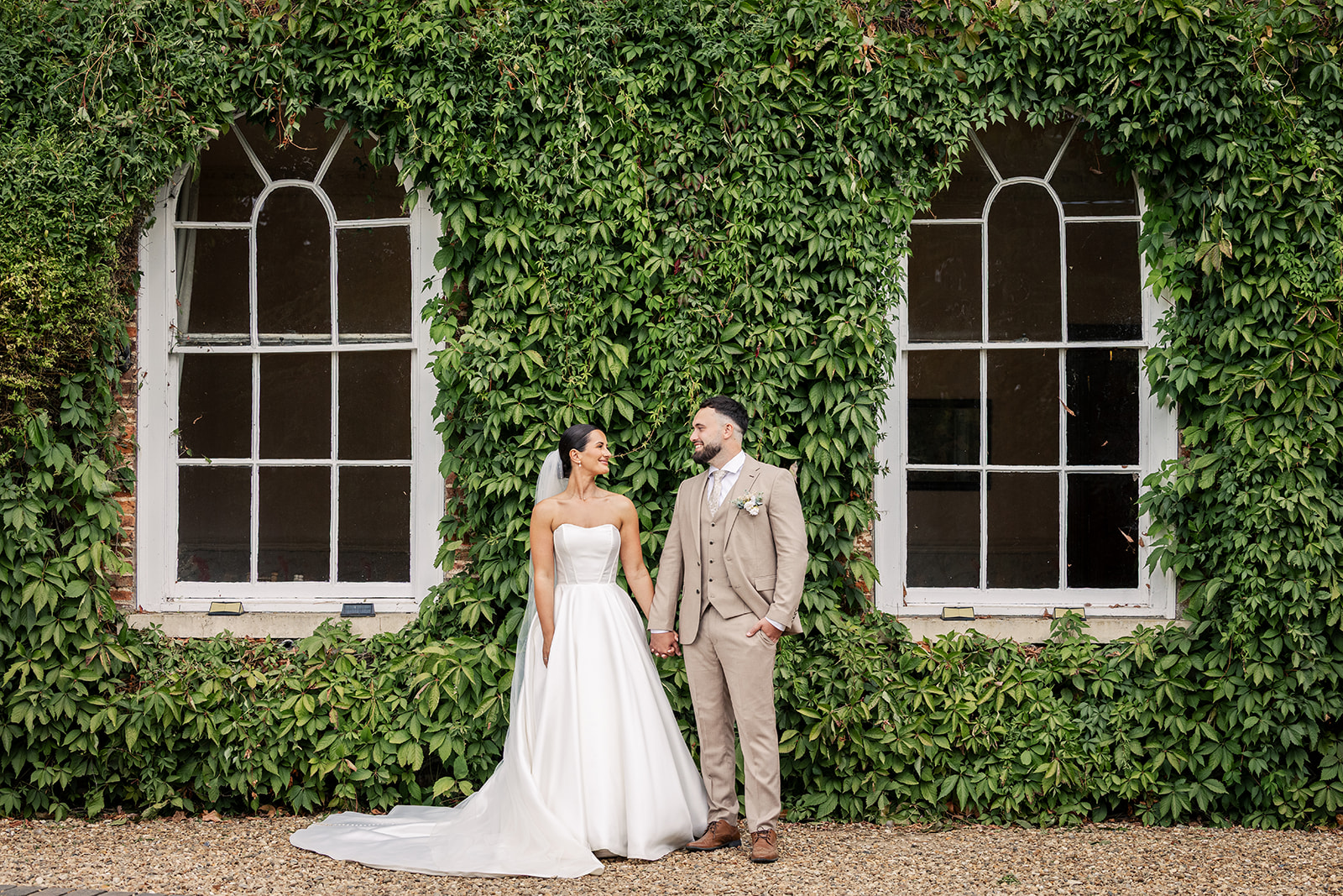
At Hockwold Hall, our white Chiavari chairs and included table linens are practical starting points when discussing reception styling. Couples can build their chosen colours through flowers, napkins and stationery while working with the furniture already provided.
Our hedged outdoor ceremony aisle offers a different starting point: greenery is already part of the scene. That is worth considering when choosing flowers and clothing for the ceremony.
Walk through your whole day when you visit a venue. Think about the ceremony, drinks reception, wedding breakfast and evening celebration, rather than designing each area separately.
You can repeat a few colours across these spaces without decorating them identically. An olive ribbon outdoors might become an olive napkin at dinner, while burgundy appears in both the bouquet and printed menus.
Our marquee gallery and outdoor ceremony page can help you picture the different settings before a visit.
Consider the Season Without Feeling Restricted by It
Season can help you refine your colours, if you have chosen your wedding date based on a season you love, try leaning into the colours of the season.
You can choose burgundy for a spring wedding or pale blue for a winter celebration. The supporting shades, materials and amount of colour you use can change how the combination feels. A pale blue, used in winter, can easily be transported to a summer colour palette by combining it with a terracotta or lemon colour to brighten it up.
For spring, you might pair a favourite deeper colour with plenty of ivory and lighter floral tones. For an autumn date, you can focus more on deeper tones to lean into the cosy and intimate feel of Autumn and pair it with a lighter/ pastel version of one of your chosen shades, to lighten up the overall theme.
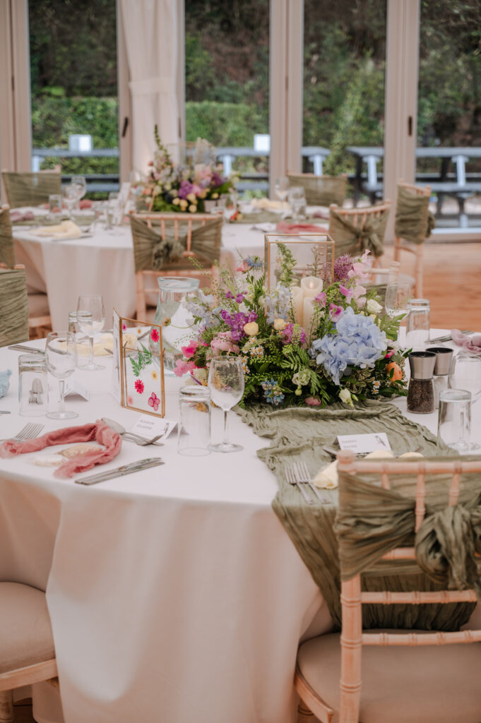
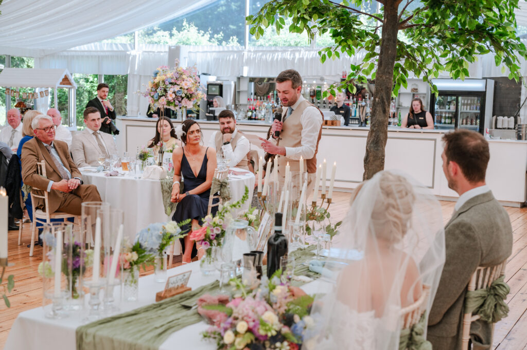
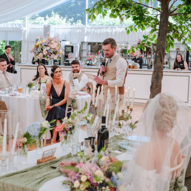
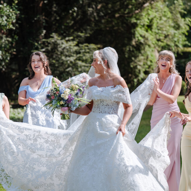
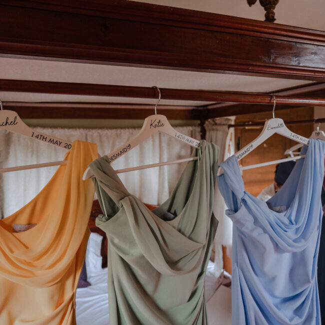
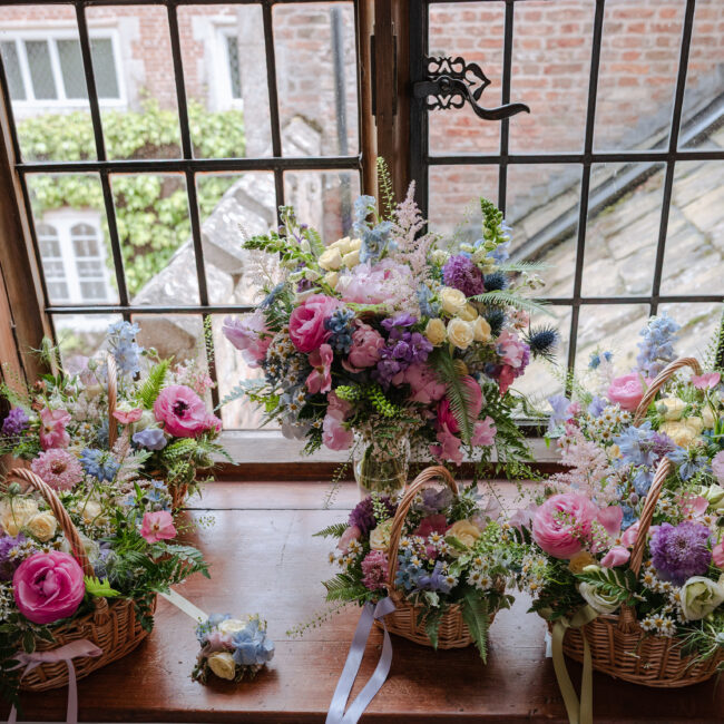
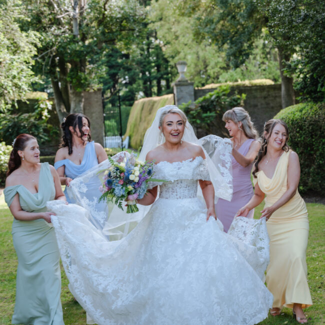
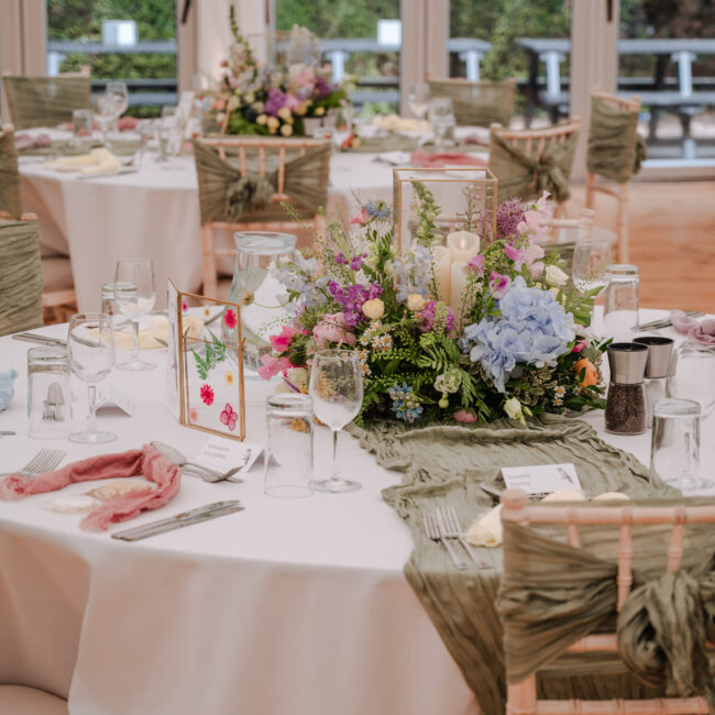
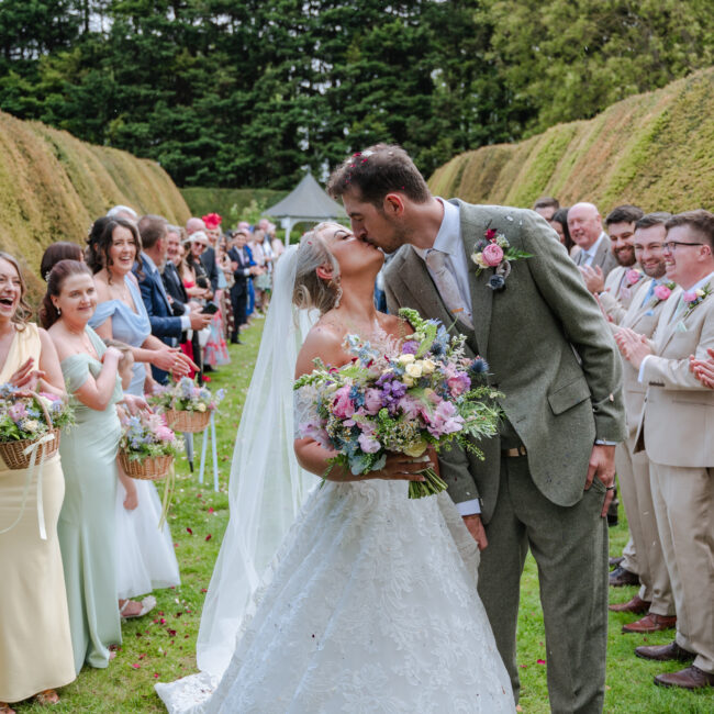
D & M’s May 2026 wedding is a lovely example of how a colourful palette can feel cohesive. Their playful mix of pastel shades stood out against the marquee’s neutral ivory backdrop and the natural greenery of the ceremony space.
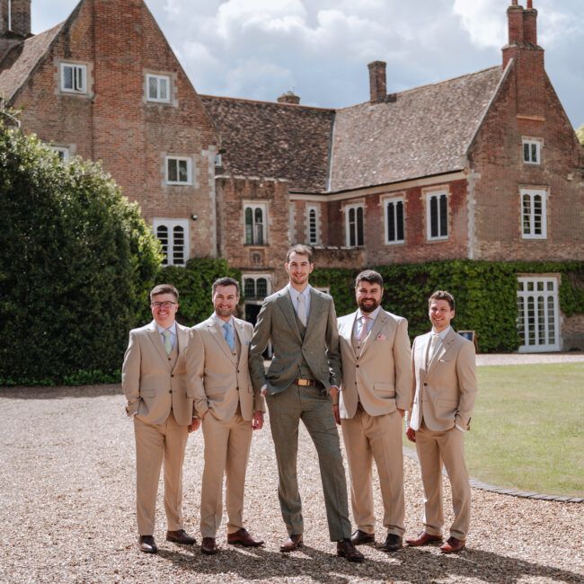
Flowers brought the palette together, with each pastel shade echoed in the bridesmaids’ dresses and groomsmen’s ties. Olive-green chair sashes and decorative trees added depth, while brushed gold details introduced warmth and a subtle metallic finish.
For local flowers, speak to your florist about what is likely to be available around your date and what substitutions they recommend. We have a lot of couples who love a peony, only to realise they’re only available a few weeks of the year.
Norfolk Flower Farm in Edgefield describes its locally grown wedding-flower season as running from mid-April to mid-October. That is the grower’s own supply window, rather than a guarantee that every flower will be available throughout those months.
Norfolk florist The Botany House also describes warmer pinks, apricots, peaches and lilacs among its own 2026 couples’ choices. This is useful local inspiration, rather than evidence that all East Anglian couples are choosing those shades.
Give your florist a colour direction and explain what you particularly love. Allowing some flexibility can help them suggest suitable flowers rather than having to reproduce a photograph stem for stem.
Carry Your Colours Through the Day
A cohesive wedding colour palette relies on repetition, but every item does not need to contain every colour.
Choose where each shade will appear and allow some elements to remain simple.
Stationery and signage
Your invitations can introduce the palette through paper, lettering, envelopes or a small illustration.
Carry one or two of those features into your seating plan, menus and place cards. Reusing a typeface or border can help everything feel related without requiring elaborate designs.
Keep readability in mind. Guests need to find their table and read their menu comfortably, so test the contrast between lettering and background before approving a print run.
Your brighter more signature colours should appear as highlights rather than full signage. Keep the background to your paler colours and add the main colour for the details.
Clothing and flowers
Bridesmaid dresses, suits, ties and bouquets can sit within the same palette without being identical.
If your dresses are olive, your flowers do not need to reproduce that exact green. Share a fabric swatch with your florist and discuss the overall balance you want.
Natural flowers contain variations in colour. A bouquet can connect several tones rather than behaving like a perfectly matched paint sample.
Tables and smaller details
Choose a few places where colour will make the strongest contribution.
Napkins, flowers and printed menus might provide everything your table needs. Favours, glassware and other practical items can remain neutral.
For an olive green and burgundy wedding, you could use olive napkins, burgundy floral accents and ivory menus. A small gold frame for the table number would introduce the metallic finish without overwhelming the arrangement. Each table remains cohesive to the colour palette without every individual detail having at least one detail in the colour scheme.
Use Metallic Details with Intention
Metallics work particularly well when they have a clear role.
You might choose brushed gold for table-number frames and candleholders, or silver for stationery foil and selected decorative pieces.
There is no requirement to make every metal match. If the venue’s cutlery differs from your chosen accent, look at the complete table before assuming you need replacements.
The same applies to jewellery. Your wedding rings and personal accessories do not need to follow a table-styling decision.
Be clear when describing metallic details to suppliers. “Gold” can mean anything from a pale champagne finish to a bright yellow tone.
If you want foil on stationery, ask for a sample. Gold-coloured printing and metallic foil are different finishes, so make sure the quotation covers the effect you expect.
For candles or decorative installations, check the venue’s requirements before booking or buying anything.
Test Your Palette Away from a Screen
A saved photograph is a useful reference, but it is not a reliable physical colour sample.
Screens, editing and lighting affect what you see. Paper, fabric, flowers and reflective surfaces also behave differently.
Stationery specialist Paper Meadows recommends starting with physical references and explains how paper stock can change the appearance of printed colours.
Build a small sample collection before placing larger orders:
- A fabric swatch from your chosen dresses or suits.
- A linen or napkin sample.
- A printed stationery sample.
- A reference for your preferred metallic finish.
- A short selection of flower photographs.
Look at the samples together in daylight and under warm indoor lighting. If possible, bring them to the venue.
Arrange a simple place setting using a plate, glass, napkin and sample menu. Step back and consider the whole arrangement.
Are the colours balanced? Is one shade dominating more than you intended? Can you read the menu clearly?
If something feels wrong, change one element at a time. A slightly warmer ivory or a more muted green may resolve the issue without replacing the entire scheme.
Keep the Palette Cohesive Without Overspending
A clear palette should make decisions easier, including decisions about what you do not need.
Begin with your priorities. If flowers matter most to you, allow them to carry more of the colour. If you love stationery, invest attention in that design and keep other details straightforward.
Check what your venue provides before ordering linens, chairs, table-number holders or other items.
Then make three lists: included items, essential additions and optional extras. This helps prevent small decorative purchases from quietly becoming a substantial expense.
Leave a little room in the styling budget for ideas you discover later. You may find a napkin colour or stationery detail you love, and having some flexibility is more useful than spending everything at the beginning.
Ask suppliers where an adjustment would make the biggest difference. A different linen, a simpler arrangement or one consistent ribbon colour may achieve more than several unrelated additions.
If you want to move flowers between the ceremony and reception, agree the practical arrangements beforehand. Someone needs to be responsible for moving them, and the designs must suit both locations.
Give Your Suppliers One Clear Reference
Once you have made your choices, bring them together on a single page.
Include your main colours, a photograph of the physical samples, the preferred metallic finish and a few images that show the overall direction.
Add short notes explaining what you like. “The muted green, not the bright pink flowers” is more helpful than sending a photograph without context.
Mention any colours or finishes you particularly want to avoid.
Share the same version with your florist, stylist, stationery designer and anyone else involved. If you change a major element, update everyone affected.
Also tell suppliers where there is flexibility. You might need the napkins to match a purchased fabric but be happy for the flowers to include a broader range of burgundy tones.
That distinction gives them room to advise while protecting the details that matter most to you.
How do I choose a wedding colour palette?
Start with colours you both enjoy and the atmosphere you want to create. Consider your venue, then choose a light shade, a deeper shade and an optional metallic finish. Test physical samples together before ordering.
How many colours should a wedding palette have?
Three or four connected colours or finishes are a manageable starting point. You might choose ivory, olive, burgundy and brushed gold. Give each a role and allow natural variations rather than treating the number as a strict rule.
Do bridesmaid dresses, flowers and table decorations need to match?
No. They should feel connected, but they do not need to be identical. Share fabric swatches with your suppliers and repeat selected shades across the day. Flowers can include several complementary tones.
What colours go with olive green and burgundy for a wedding?
Ivory or cream can provide a lighter foundation, while brushed gold adds a warm metallic detail. Compare samples because olive and burgundy both vary between suppliers. Adjust the proportions to make the scheme lighter or richer.
Should my wedding colours match the season or the venue?
Consider both, but neither needs to dictate your choices. Your venue provides an existing backdrop, while the season can influence flower availability. Begin with colours you love and adapt the supporting details to the setting.